Ten top tips to great website design
Your website design is your shop front, the shop window; your home page is your clients’ first impression of your business. There are many things which can turn a browser into a customer, this we’ll cover in more depth in a later blog, but first you have to get the basics right. In this blog article we look at everything from page speed, to colours and what they mean.
- Website page load times
- Provide clear easy navigation between pages & content
- Optimise your images & use sprites
- Keep page content precise and clear
- Ensure spelling and grammar is correct
- Use of colour and design
- Maintain your website links
- Write with your target audience in mind
- Browser compatibility
- Multi platform friendly
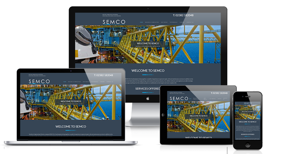

Website Page Load Times
Your website design is your shop front, the shop window; your home page is your clients’ first impression of your business. There are many things which can turn a browser into a customer, this we’ll cover in more depth in a later blog, but first you have to get the basics right. In this blog article we look at everything from page speed, to colours and what they mean.
Provide clear and easy navigation between web pages
When your browsers land on your web page, there should be clear easy quick navigation to the information, product or service they’re looking for. No one wants to spend their precious time trying to figure out how to get to where they want to go, if that’s the case you have the risk of losing them to the next website.
If your page is full of useful information broken down into different sections, utilise a sub-menu with anchor links to each section for quick easy navigation.
Once you have draughted your initial web page design, get a third party to look at the page and ask them if it is easy to navigate and find what they’re looking for once on the home page. You will find that if you ask several people to look at the web page design, they will all probably point out different things they may find good or bad about the way the page is set up. This can help you fine tune your final website page design so it is user friendly.
Good website navigation should:
- Be consistent throughout the website
- Support the users goals
- Be easy to learn and use for your browsers
- Be within context of the website

Optimise your images & use Sprites
Images take up a large part of your download time, so having your images optimised is essential. The photographs that your camera and even your trusty smart phone take are more than often way too big for use on a website without first optimizing their size.
The best way to ensure that you get the optimum image quality without any un-required additional size, is to resize your images to the pixel size they are going to display at. If you have an image space of 100px by 100px, then resize your image accordingly. Programs such as Adobe illustrator will save an image at 72dpi if you ‘Save for web & devices’, whether it’s 300dpi or 72dpi, you won’t see any difference on a screen if both images are 100px by 100px and set to display as that, so 72dpi will be fine for web use.
Image formats:
- PNG– These are good for flat and photographic images where you may want a transparent background
- GIF– Use for flat images with just a few colours, & good for animated banners
CSS Sprites
Images which are used across several pages of your website, such as your logo do not need to be re-downloaded on every page load. When a sprite file is downloaded by a web browser, it’s caching the image library for your website, so now when an image is requested to be displayed it’s already cached so displays quickly. This also reduces the HTTP request for your page which will also dramatically speed up your page load times.
Keep page content precise and clear
When people are viewing websites on-line, it’s different from reading a magazine or paper, people want to find the information they’re looking for quickly, especially when landing on your home page.
So make sure your page gets the information or products across to the browser in a fashion where they don’t have to read through lots of irrelevant information before finding what they want to know.
- Use hypertext to navigate to information
- Draw on your personal experiences for the content (keeping it personalised where you can)
- Provide precise information with some detail for those who want more than the basics

Ensure spelling & grammar is correct
Poor spelling and grammar may seem like a minor mistake to make, but could lose you a potential customer. Many browsers using the World Wide Web can leave a page and website if there are many grammar or spelling errors. People do judge websites and in turn businesses from the quality of their content which includes spelling and grammar. The simplest mistakes of using their where you should have used they’re can turn away a potential customer.
So once you have finished your website page text, check, check and check again before you go live with your website. You’ll often find that because you’ve written the text you may miss obvious mistakes, the brain is very good at compensating for errors, look at this example. Getting someone else to proof read your article and pages would be a good idea to make sure you don’t miss any.
Use of colour and design
Colour and design is critical with good website design, choosing the correct colours for your business could make all the difference. For example have you ever noticed how the well known fast food chains and restaurants predominantly use red, yellows and oranges in their logo design, interiors and signage? This is no accident and is because of the following facts:
- Red– This colour is kin, as this colour is associated with impulsiveness and excitement. Most importantly red is associated with hunger.
- Orange– This is also associated with energy and excitement, orange is a warm colour that makes people feel comfortable and hungry.
- Yellow – The brain actually releases serotonin when it sees yellow (the feel good chemical), this makes a more optimistic person, so they will be more likely to spend out on drinks, dessert and a large meal.
Where, on the other end of the spectrum, some hospitals in America have their nurses in light blue and pale pink uniforms, these are soothing and calming colours that relax the patients.
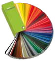
When designing your website, take into consideration the following:
- Target age –What age is your core market, whilst children like bold and bright colours, an older audience would prefer pastel shades.
- Target Gender –Men tend to prefer blues and greens whilst women tend to prefer reds and oranges.
- Trends –Colours like everything else in design go through stages of popularity.
The psychological properties of colours:
- Red – Physical, warmth, hunger, energy, stimulation, excitement.
- Blue –Intellectual, communication, trust, efficiency, logic, calm.
- Yellow –Emotional, optimism, self-esteem, friendliness, creativity.
- Green –Balance, harmony, refreshment, environmental, peace, balance.
- Violet –Spiritual, containment, vision, luxury, truth, quality.
- Orange –Comfort, food, warmth. Sensuality, passion, abundance, fun.
- Pink –Tranquillity, warmth, nurture, femininity, love, sexuality.
- Grey – Neutral
- Black –Sophistication, glamour, security, substance
- White –Hygiene, sterility, purity, sophistication, support, reliability.
- Brown –Nature warmth, seriousness, earthiness
Maintain website links
Having broken links on your website is a sign for readers and search engines that your website is not maintained. Why should you expect someone to take the time to view your website pages, if you can’t take the time to maintain the websites links and content? Valid links not only keep your browsers happy, but also ensure that search engines spiders can navigate your site successfully, after all if they can’t navigate your website, they can’t index its pages.
TIP: Use a good HTML checker as recommended by Google to ensure your HTML is tidy and none of your links are broken.
Write with your target audience in mind
When writing your website, do bear in mind what audience you are targeting. Writing in a way that is aimed at your target audience not only ensures it is easy to read for that market, but also ensure you include the key words that they will most likely put into a search engine when searching for your business type. Writing with key words in mind and included in your web page text can help with your Search Engine Optimisation (SEO), thus helping to give you a higher result for those search terms.
For example you may be an architect supplying plans for extensions and loft conversions. You may think that ensuring ‘architect’ is prominent in your literature, where as ‘house plans’ is a far more common used search term.

Browser Compatibility
Multi platform friendly
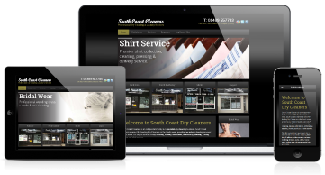
With the ever growing choice of devices to view website on, including PC’s, laptops, tablets and smart phones, to ensure your website looks good on all devices is essential.
In August 2013 7.4% of web traffic was through mobile phones and 12.2% was through tablet devices in the UK, that’s nearly 20% of all web traffic through devices other than PC’s and laptops. This growth of percentage share of people using mobile phones grew to over 50% by 2017 and is steady at just under 52% in 2018, that's over half of your possible client base viewing your website on a mobile device!
Having a website which is designed to be responsive across all devices, ensures you don’t miss out on a substantial part of the web market which is only set to grow.
Contact
-
Via the web
-
37 Hollybank Crescent, Hythe, Southampton, Hampshire. SO45 5FZ
RATED
-
 Facebook
 -
 Google
 -
 Freeindex